During my time in EY, I had opportunity to contribute to RSA (Road Safety Authority)’s transformative project aimed at enhancing the learner-to-licenced driver experience in Ireland. RSA was on a mission to refine their service delivery through MyRoadSafety.ie. This digital platform was envisioned as a one-stop destination for various RSA services, crucial to resulting an integrated customer journey that seamlessly connected driver testing, licencing, and education.
By the time I joined the project the service design groundwork had been laid, paving the way for my primary focus: product design.
Problem Statement
- A backlog of driver tests had inflated to a six-month wait time due to the COVID pandemic.
- Problem of registering or logging into MyRoadSafety.ie, spiking customer care inquiries.
- Many users struggled forgetting their security questions, which led to an uptick customer calls.
- User journey to complete the driver licencing process was muddled and frustrating due to the vague content and confusing information architecture.
Goal
Streamline all RSA’s services, ensuring a smooth and intuitive experience for all users.
User Persona
The user aranged from a learner driver to those fully licenced driver across various vehicle types
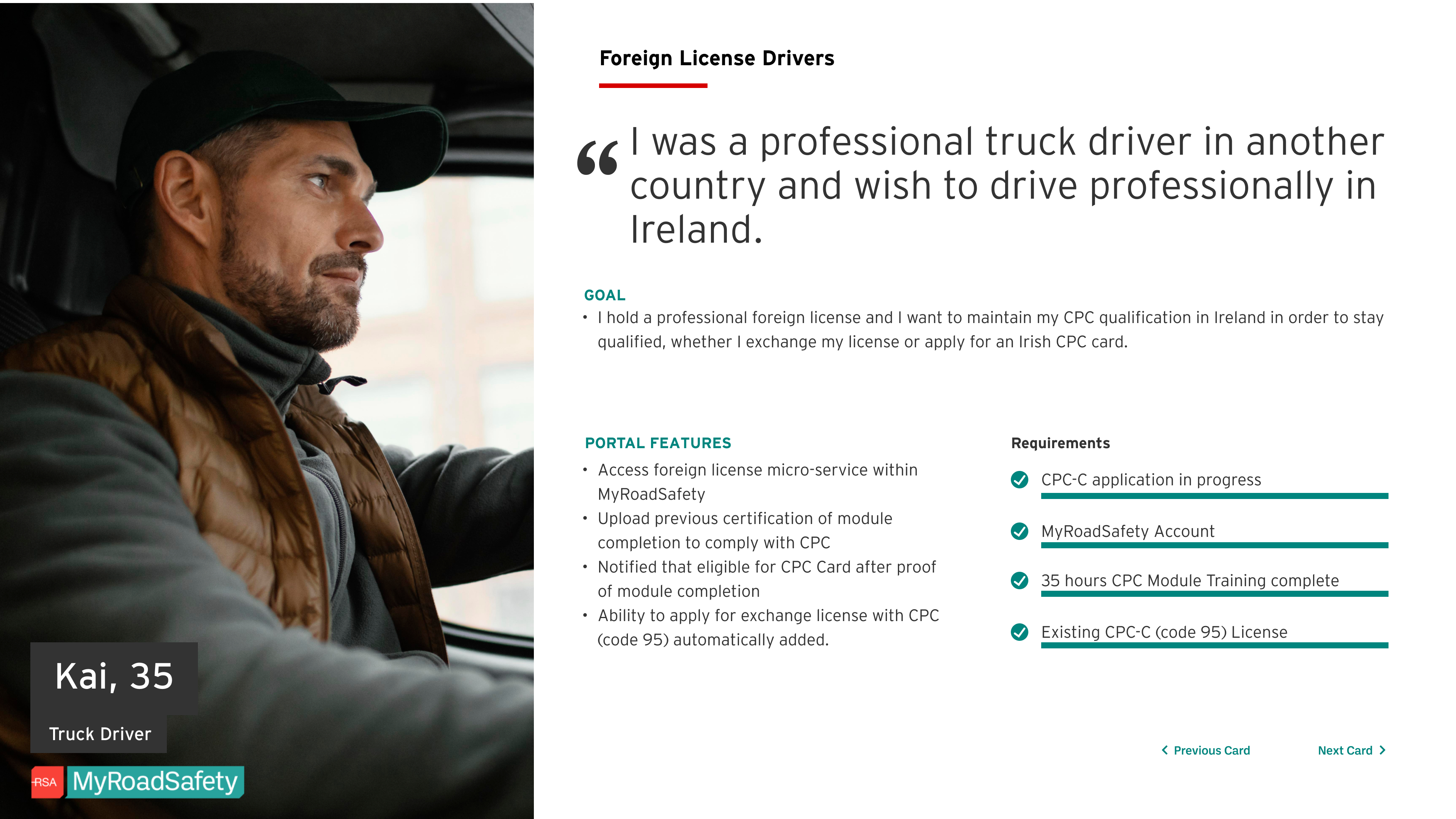
Persona for a foreign licence driver
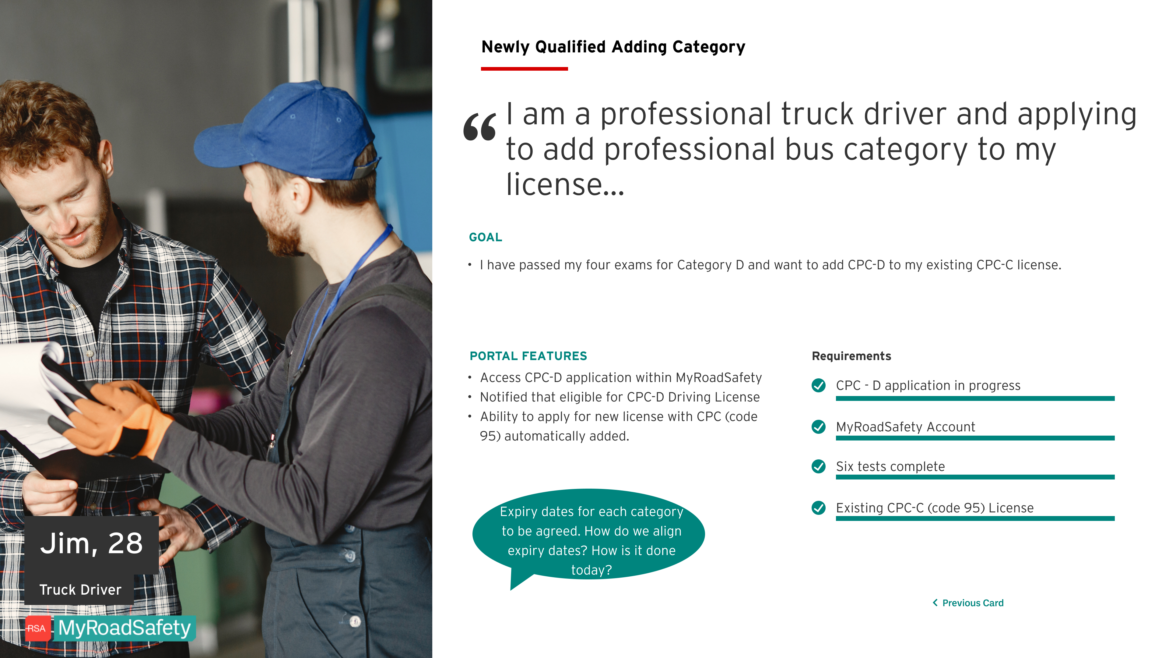
Persona for a truck driver applicant
Discovery Phase
Research
From the early phase another team has created a service blueprint, interviewed internal stakeholders and real customers. I, then gathered insights on the challenges and pain points from both perspectives.
Workshop
Regular workshops fostered co-design and collaboration with stakeholders, helping me and the team define problem and align solutions and actions
Strategy
I crafted a strategy to deliver solutions within the agreed timeline. The project adopted an agile methodology, with deliverables in each sprint.
- Splitted the project into two sections. The first focused on Login and Registration and the second on redesigning the MyRoadSafety.ie
- Using rapid prototyping and testing to help validating my hypothesis on solutions, leading to guerilla usability testing that covered diverse user cohorts and more in-depth testing with the truck drivers.
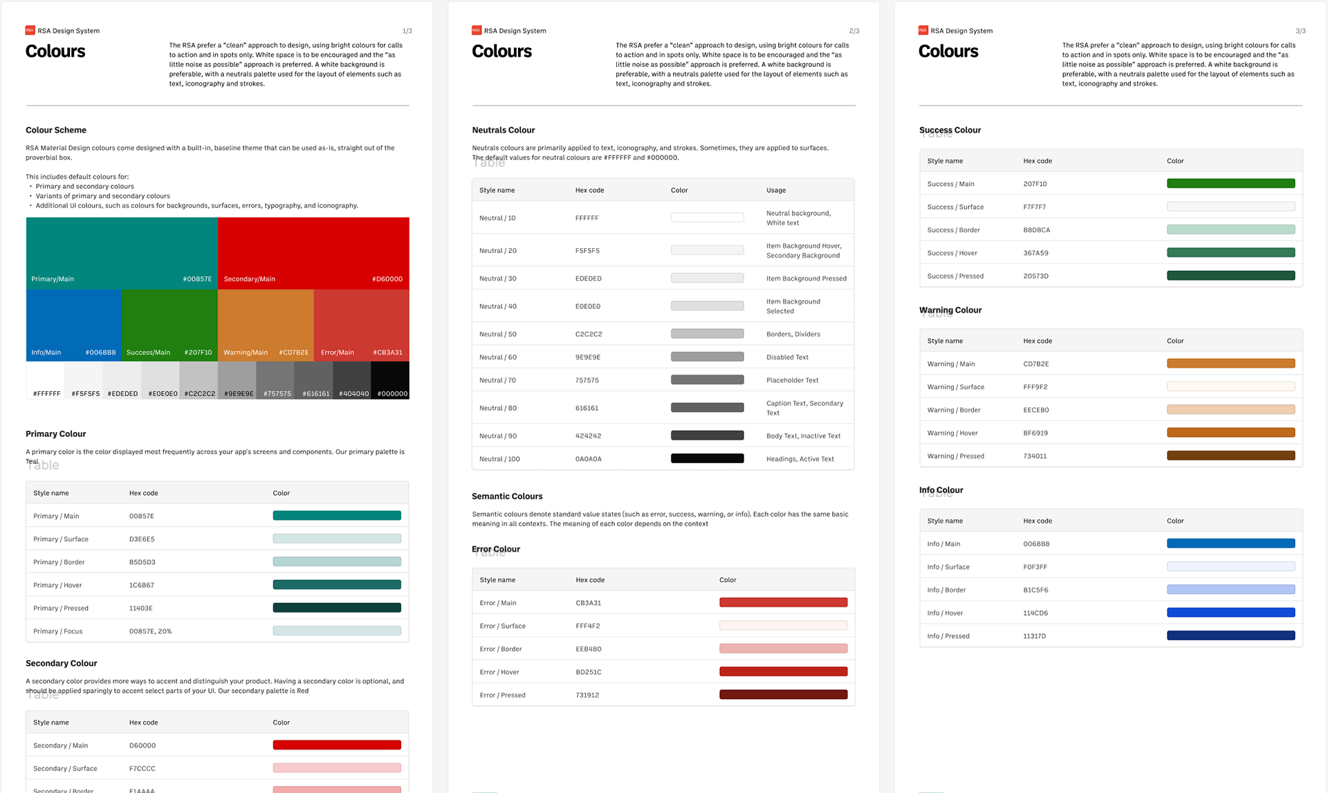
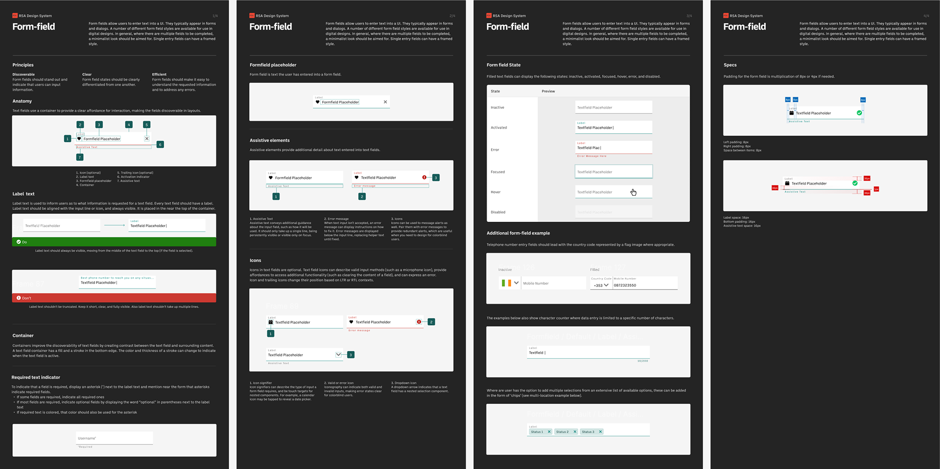
- Created a design system to ensure consistency and efficiency across design and development
Storyboard
Storyboards were used to communicate the vision to strategic level stakeholders that would have found the future state blueprint too dense to read. The storyboard demonstrated what the portal would like as a fully integrated service.

In-person workshop session with key stakeholders
Design
Login and registration
- Simplifying the login and registration process, removing the security questions for the account verification and replacing it with 2FA verification.- Clear sign-posting and messaging directed users to self solve their login/registration issues.
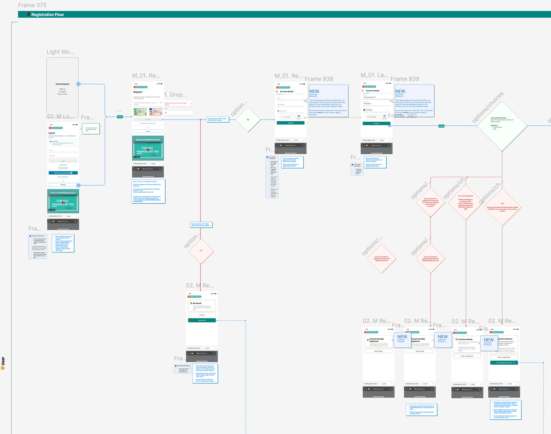
Registration Flow
Login Prototype - Happy Path
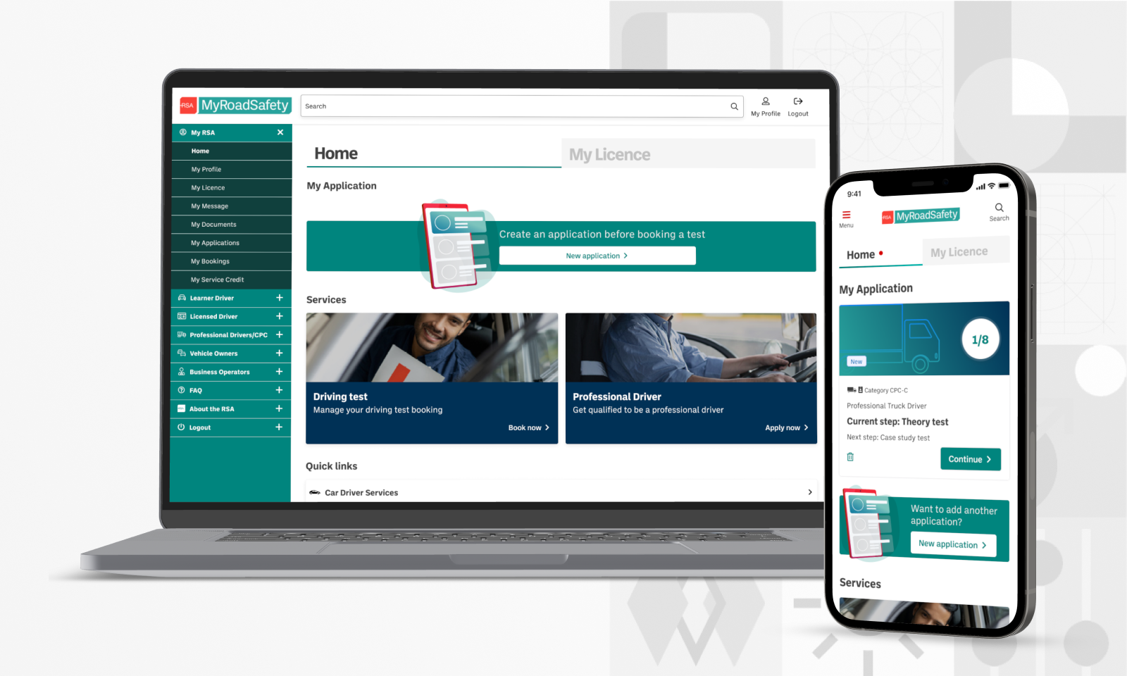
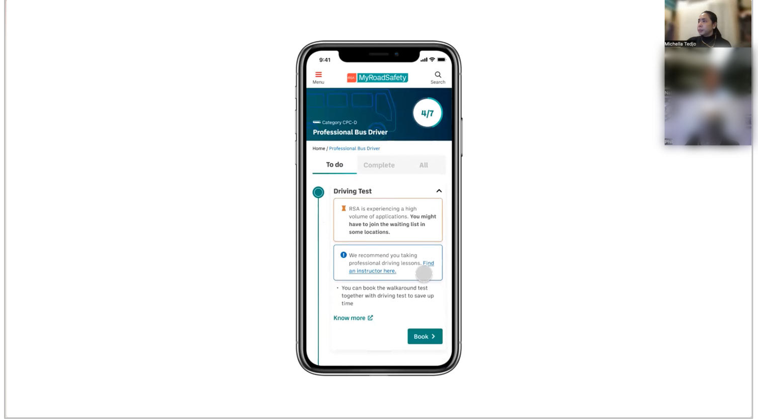
MyRoadSafety.ie portal
Reimagined the “MyGoals” experience (the terminology used for driver application). Navigation is made simpler and clearer with a guidance on the application creation. Improved, simpler information layout on the homepage, clearer user navigation, messaging, and communication.
Content review
Working with the RSA’s content manager, we refined the content through workshops, aiming for clearer communication and messaging to help user understand better and potentially self-resolve the issues.
Design system
The redesign of the portal has provided me an opportunity for the RSA to build a design system from the ground up that can be reused across multiple programmes. Reducing duplication of effort and operating costs. Created easy-to-understand documentation, with clear instructions for (the future) designers and developers for how to use the designs, making it more scalable for future improvements.
WCAG2.0 AA compliant accessibility guidelines included to ensure that new designs remain accessible and compliant at all times and that developers are reliably informed.
Usability Testing
Testing with diverse user groups, including car, bus, and truck drivers of various ages and nationalities, I used the System Usability Score (SUS) method to pinpoint usability pain points.
- Users: 5 applicants/category who have licence/learner permit
- Scenario: Apply for a license using the MyRoadSafety portal mobile prototype.
- Method:
- A Talk out Loud (ToL) and usability test mixed method.
- Participants were observed using the prototype.
- Interactions were documented.
- Constraint: A mobile prototype was tested via desktop due to remote testing constraints.
- Test duration: 30 – 45 mins
Outcome & Impact
- After many design iteration and testing, the latest score I got was higher 20 points from the benchmark, means that the usability of the website was getting better.
- Achieved a 63% reduction in queries for the BSP programme's new login and registration
- A 43% reduction in waiting list queries
- 25% reduction in queries related to cancellations, rescheduling, and refunds.
- Increased in customer satisfaction and engagement
- Drive efficiencies and future-proof RSA technology to enable growth, service delivery and support innovation and future customer and employee needs.
- Enhanced communication, simple and concise calls to action, emails and texts (all channels) to customers, makes it easier for customers to read and understand instructions and self solve.
Reflection
- Service design paved the way for product design, allowing me and the team to prioritize problems and bring strategic solutions to life.
- Usability testing proved crucial for validating ideas and improving product usability.
- Understanding our audience was key to communicating the integrated service vision. Strategic stakeholders need a simpler method for communication than tactical stakeholders.
- Working closely with developers and providing thorough documentation built trust and facilitated better design process.
Tools & Technologies
Figma Design
Azure DevOps
Thank you.